What it shows
A line tile plots a metric over time, with dates along the bottom. It can draw one line, one line per value of a dimension, or one line per metric. Tick Stacked to turn it into a stacked area chart.
| Use it for | Not for |
|---|---|
| Daily, weekly or monthly trends | One headline number. Use a KPI tile |
| How a few channels or campaigns move over time | Ranking many values. Use a Table or Bar tile |
| This year against last year on one axis | Shares of a whole. Use a Donut tile |
Example
A table of daily web traffic has one row per day and channel:
| Column | Kind | Example |
|---|---|---|
date | date | 2026-10-14 |
channel | dimension | Organic Search |
sessions | metric (sum) | 1,204 |
In the tile editor:
| Setting | Value |
|---|---|
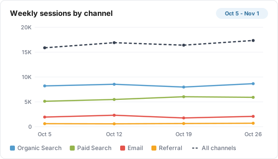
| Title | Weekly sessions by channel |
| Type | Line |
| Data Table | Daily web traffic |
| Metric | sessions |
| Group By | channel |
| Date range | Fixed dates, Oct 5, 2026 to Nov 1, 2026 |
| Bucket by | Week |
| Show total as a line | On, Line name "All channels" |
| Size | Large |
The tile draws four colored lines plus the total line, with weeks labeled by their Monday:
| Week | Organic Search | Paid Search | Referral | All channels | |
|---|---|---|---|---|---|
| Oct 5 | 8,210 | 5,120 | 1,940 | 610 | 15,880 |
| Oct 12 | 8,540 | 5,480 | 2,310 | 580 | 16,910 |
| Oct 19 | 7,980 | 6,030 | 1,760 | 640 | 16,410 |
| Oct 26 | 8,660 | 5,910 | 2,080 | 700 | 17,350 |
The legend lists the channels from the largest total (Organic Search) to the smallest, then "All channels".
Data it needs
- A metric. Ratio and calculated metrics work and are worked out per day, week or month.
- A date on each row. Every synced Lens table has one, so time is always the horizontal axis.
- For Group By, a dimension on the table or a custom grouping.
Settings
| Setting | What it does | Default |
|---|---|---|
| Title | The tile heading. Required, up to 80 characters | Empty |
| Description | Text behind an info icon on the tile, up to 500 characters | Empty |
| Size | Small, Third, Medium or Large | Medium |
| Data Table | The table to read. Required | None |
| Metric | The first (or only) line. Required | None |
| Additional Metrics | Adds one line per extra metric, in the order shown. Drag a chip to reorder. Skipped when Group By is set | None |
| Group By | One line per value of a dimension or grouping | None (total only) |
| Filters | Limits the rows the tile counts. Several filters must all match | None |
| Join with Table (optional) | Combines a second table on shared dimensions. See the limits below | No join |
| Date range | Inherit from board, Ignore (all available data), Relative range, or Fixed dates | Inherit from board |
| Bucket by | Auto (recommended), Day, Week or Month | Auto |
| Compare overlay | None, Previous period (matching window), Previous year (full Jan-Dec), or Previous N years (full Jan-Dec each) | None |
| How many years back | For Previous N years: 1 to 10, one line per year | 2 |
| Compare To | Adds the prior window as a dashed grey line. Options as on the KPI tile | None |
| Stacked | Draws a stacked area chart. Shown when Group By or Additional Metrics is set | Off |
| Show total as a line | With Group By: draws the total of every value as one more line over the groups | Off |
| Line name | The legend name of the total line | Total |
| Thresholds (optional) | Under Health monitoring: Alert below, Warn below, Warn above, Alert above | Empty |
| Stopped-moving alerts | Alert after N days at exactly zero, or N days unchanged (1 to 60) | Empty |
| Flag anomalies automatically | Flags the latest day when it falls outside a normal range learned from the tile's own days | Off |
| Sensitivity | High, Medium (recommended) or Low | Medium |
| Weekly pattern | Compare like-for-like weekdays (recommended), or ignore the weekly pattern | Like-for-like |
How it calculates
- Buckets. Rows are added up per day, week or month. Ratio and calculated metrics are worked out once per bucket from their parts, so a weekly conversion rate is the week's conversions over the week's sessions.
- Auto grain. If the board sets a default trend grain, Auto uses it. Otherwise Auto picks day for ranges up to 120 days, week for 121 to 365 days, and month for longer ranges or a year-style overlay.
- Weeks start on Monday and are labeled with that Monday's date. Months are labeled like "Oct 2026", days like "Oct 14".
- Empty buckets plot as 0. Every day, week or month in the range gets a point, even with no rows.
- Group By. Lines are ranked by the metric's total over the range, and only the top 6 are drawn. The rest are left out, with no "Other" line. Empty values show as "(not set)". Show total as a line still counts every value.
- Order of precedence. Group By wins over Additional Metrics. Compare To applies only to a single line, with no Group By and no additional metrics.
- Compare To. The prior window is lined up by position: its first bucket sits under the current first bucket.
- Compare overlay, previous period. One line per period on a "Day 1, Day 2, ..." axis, by day.
- Compare overlay, previous year or N years. One line per year on a January to December axis, by month unless you pick another grain. With Date range on Inherit, the current year runs from January 1 to today. Trailing empty months are trimmed.
- Rounding. Values are rounded to two decimals and formatted with the metric's format.
- Health. Every check judges the most recent day in the tile's data, using the total across all lines for the first metric. Thresholds win over the automatic range. The automatic range needs at least 8 earlier days, and with the weekly pattern on, about three of each weekday.
- No data. On the board the chart draws a flat line at zero. On the public report the tile reads "No data available".
What viewers can do
| Action | Board | Public report |
|---|---|---|
| Hover a point | Shows every line's value for that day, week or month | Same |
| Click a legend entry | Hides or shows that line | Same |
| Change dates, compare, filters | Board picker, board comparison and filter chips | Same, unless the board hides them |
| Read the description | Info icon | Info icon |
| See health | Colored dot, with the reason on hover | Same |
| Summarize with AI | When AI features are on for the property | No |
Limits and gotchas
- Only 6 groups are drawn. With more values, use a custom grouping to combine the small ones, or a filter.
- Do not group by
date. That splits the chart into one line per day. Leave Group By empty for a single trend line. - Compare To is silently skipped with Group By or Additional Metrics. The setting stays saved but draws nothing.
- Compare overlay ignores Group By, Additional Metrics, Stacked and the total line. It plots the first metric only. In previous-period mode, days with no rows are skipped rather than drawn as zero, which can shift the lines out of step.
- Compare To is measured from the board's date range, even when the tile has its own range. See the KPI page for each option's window.
- Additional metrics share one axis, formatted like the first metric. Mixing revenue with session counts flattens the smaller one.
- First and last buckets can be partial. A weekly or monthly chart whose range starts or ends mid-week or mid-month shows a lower first or last point.
- Derived dimensions do not split a line tile. Grouping by one draws a single "(not set)" line. Use a stored dimension or a custom grouping.
- Very large breakdowns can be cut. The tile reads up to 5,000 rows (one per day and group value), largest first. A Group By with many values over a long range can drop the smallest rows.
- Joins are board-only. The public report ignores Join with Table. See Join Tables.